A New Look for a New Decade
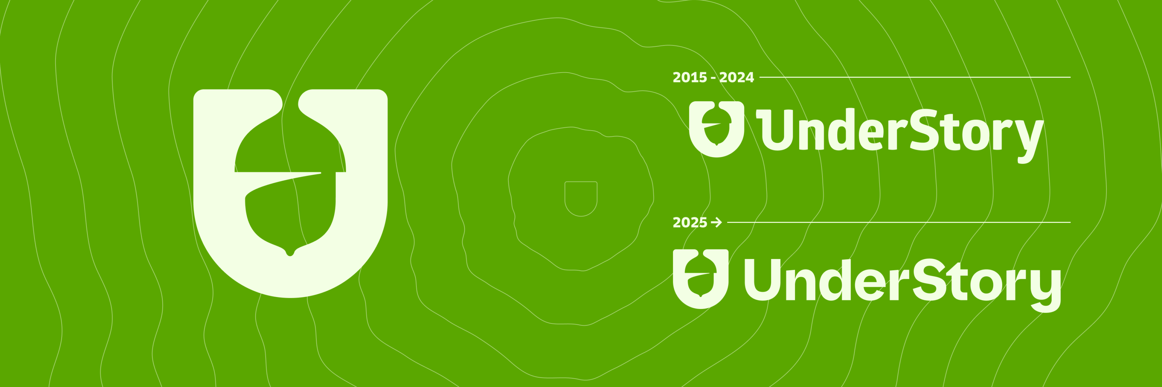
Our new logo is an evolution from the logo we've had since our beginning. It was time to freshen up after 10 years in business.
Our overall goal was to improve the logo's scalability to read well when scaled large or small with a nod to our brand's organic/tech blended roots. We kept our acorn U shaped mark, but tweaked its overall form and improved its shape to add a bit more dimension. The new logotype is set with the font Hypertext Display Bold with customized letters and fully custom letters mixed in to make our new logo truly ownable.
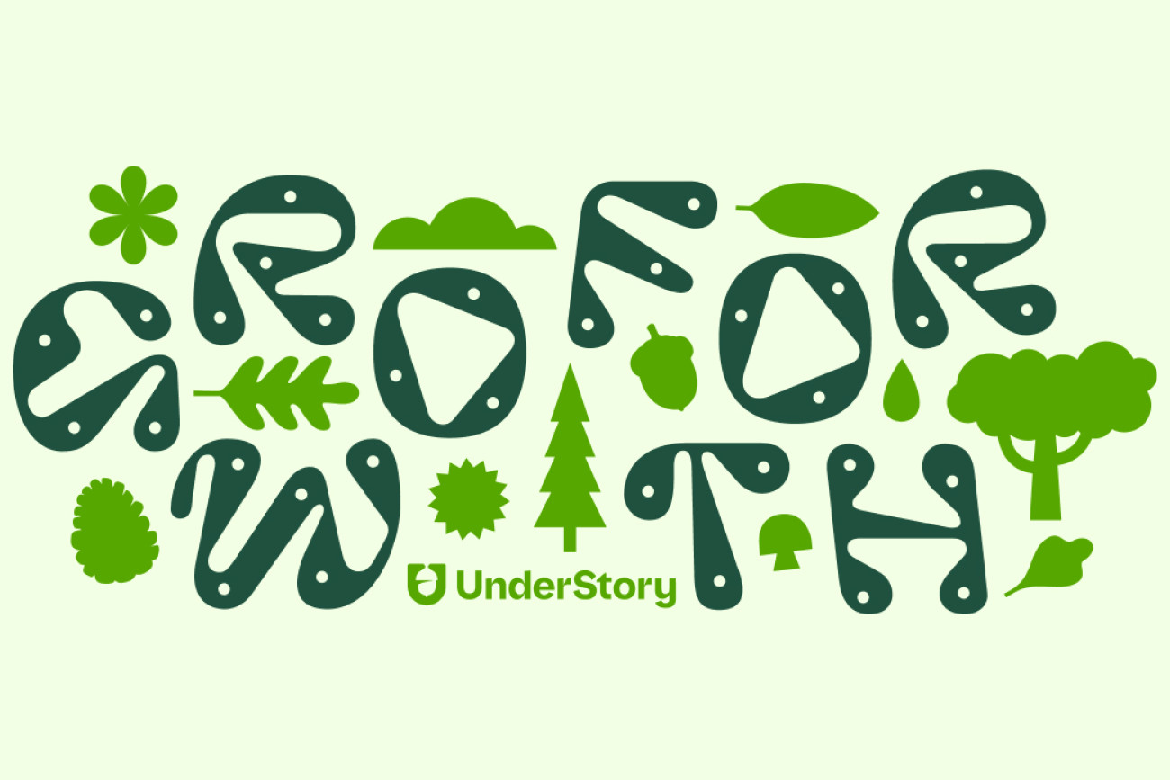
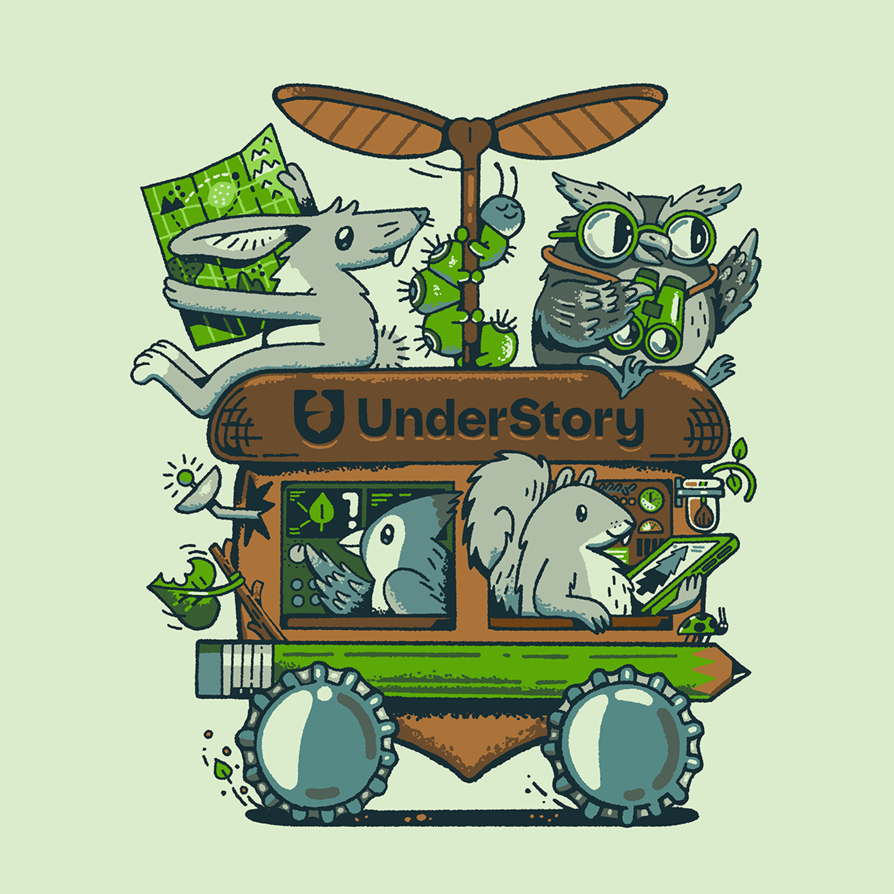
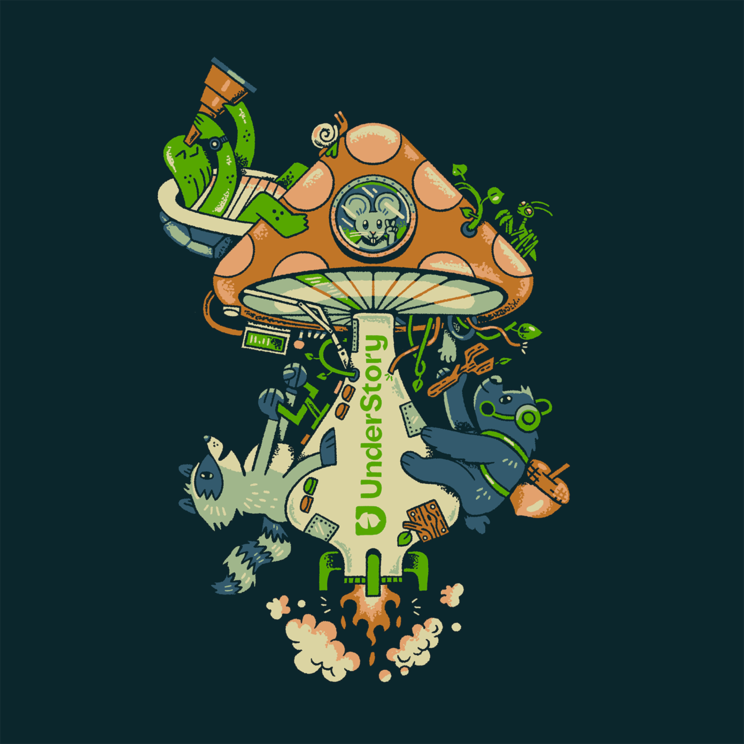
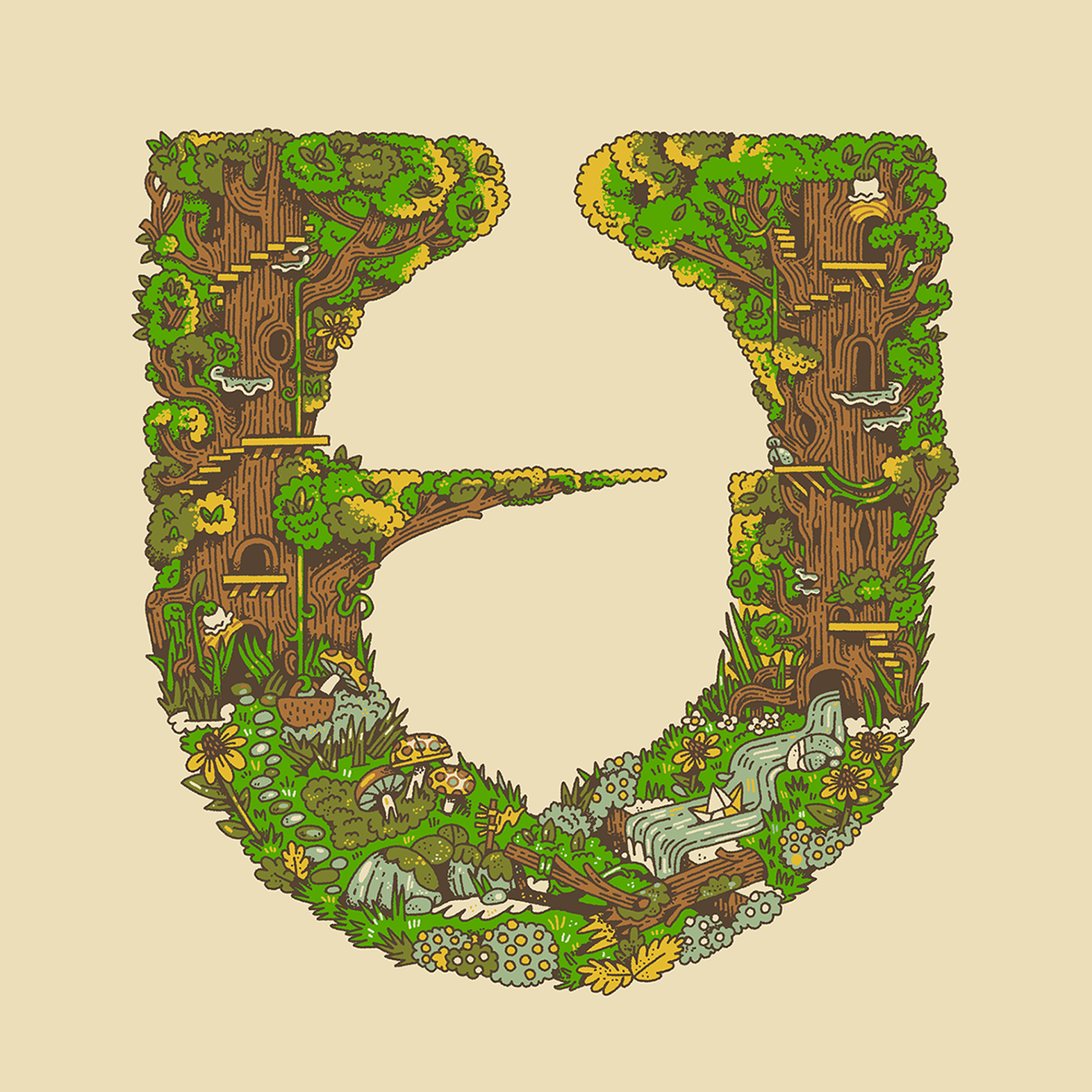
New UnderStory Branded Illustrations
We partnered with our friend and amazingly talented illustrator, Carly Berry, for some fun illustrations that we used for stickers and brought to life on our website (a little hint is our logo at the bottom of each page). Each illustration tells a different story of our new "Grow Forth" mantra with woodland creatures in our own little world.
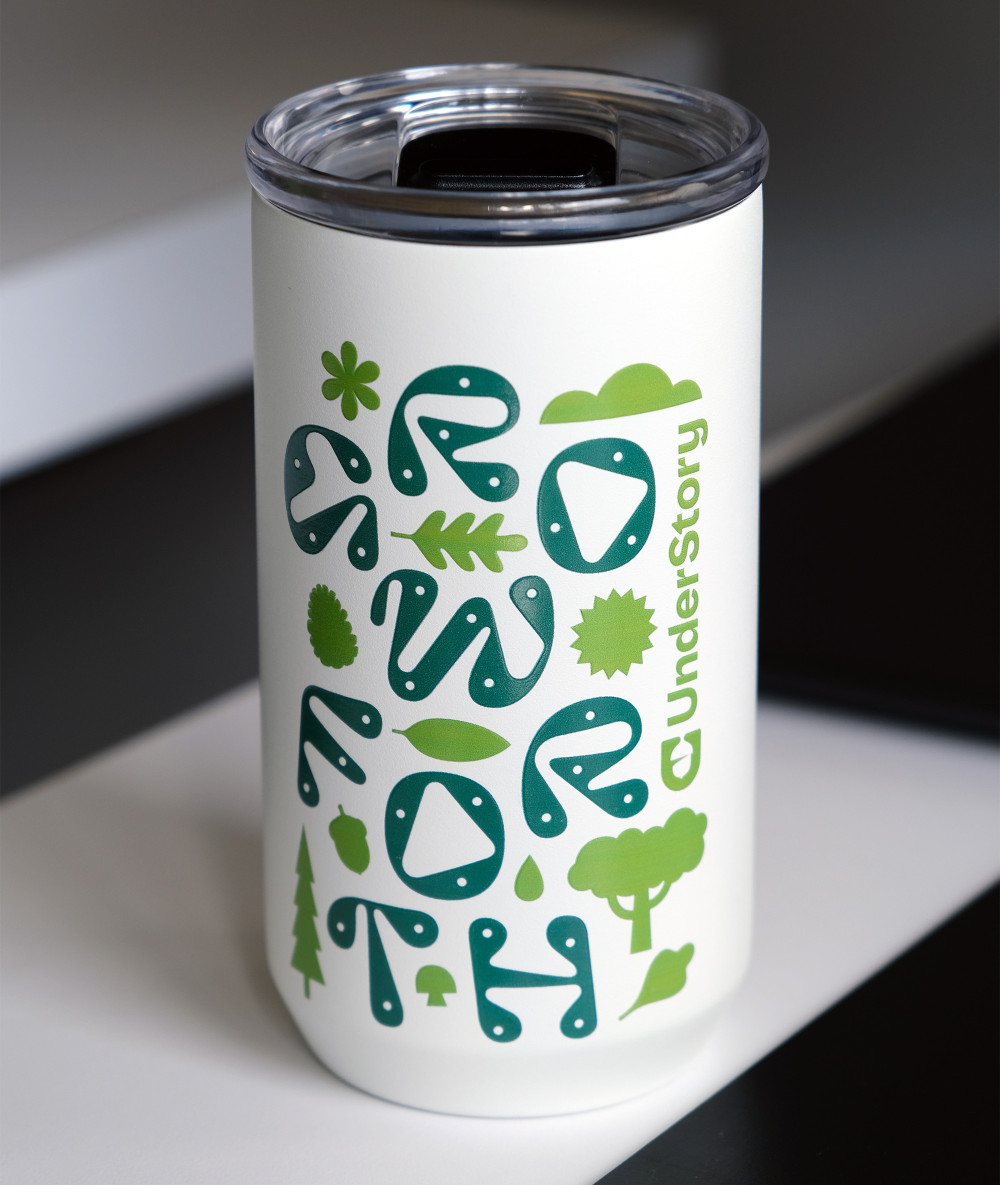
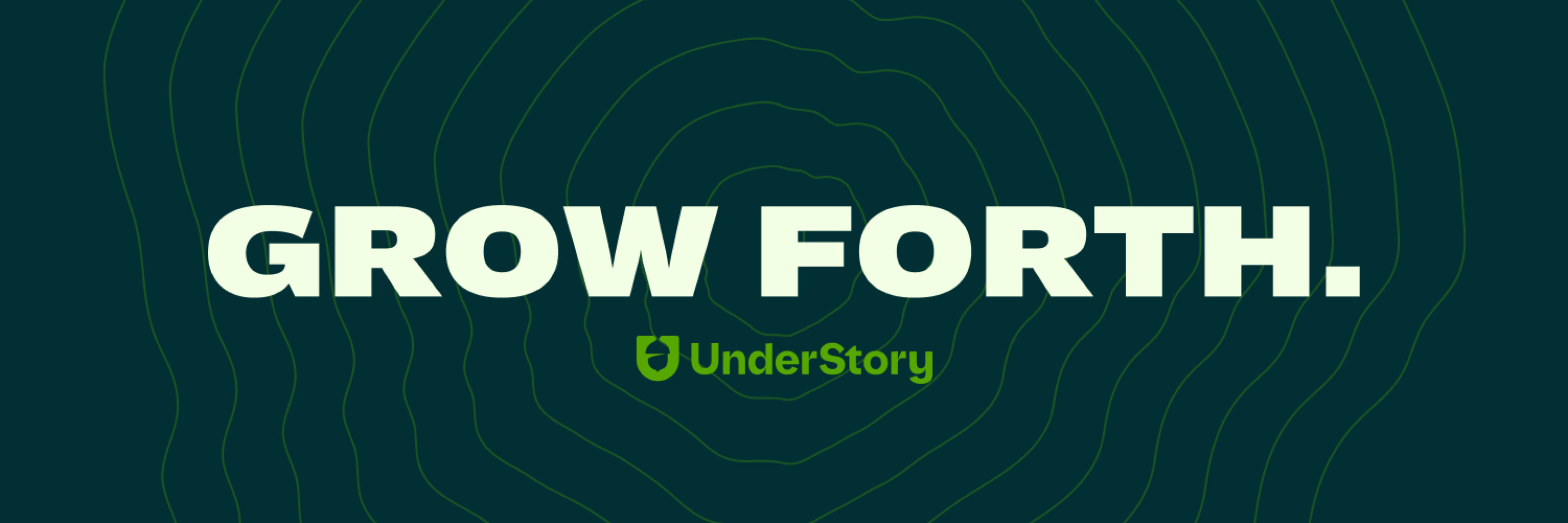
We designed a "Grow Forth" graphic used for the website and for tumblers we gave to our friends, clients, and colleagues as part of our 10 year anniversary celebration.
We're excited about our new brand rollout as it's always a labor of love. So keep an eye out because there's more to come!
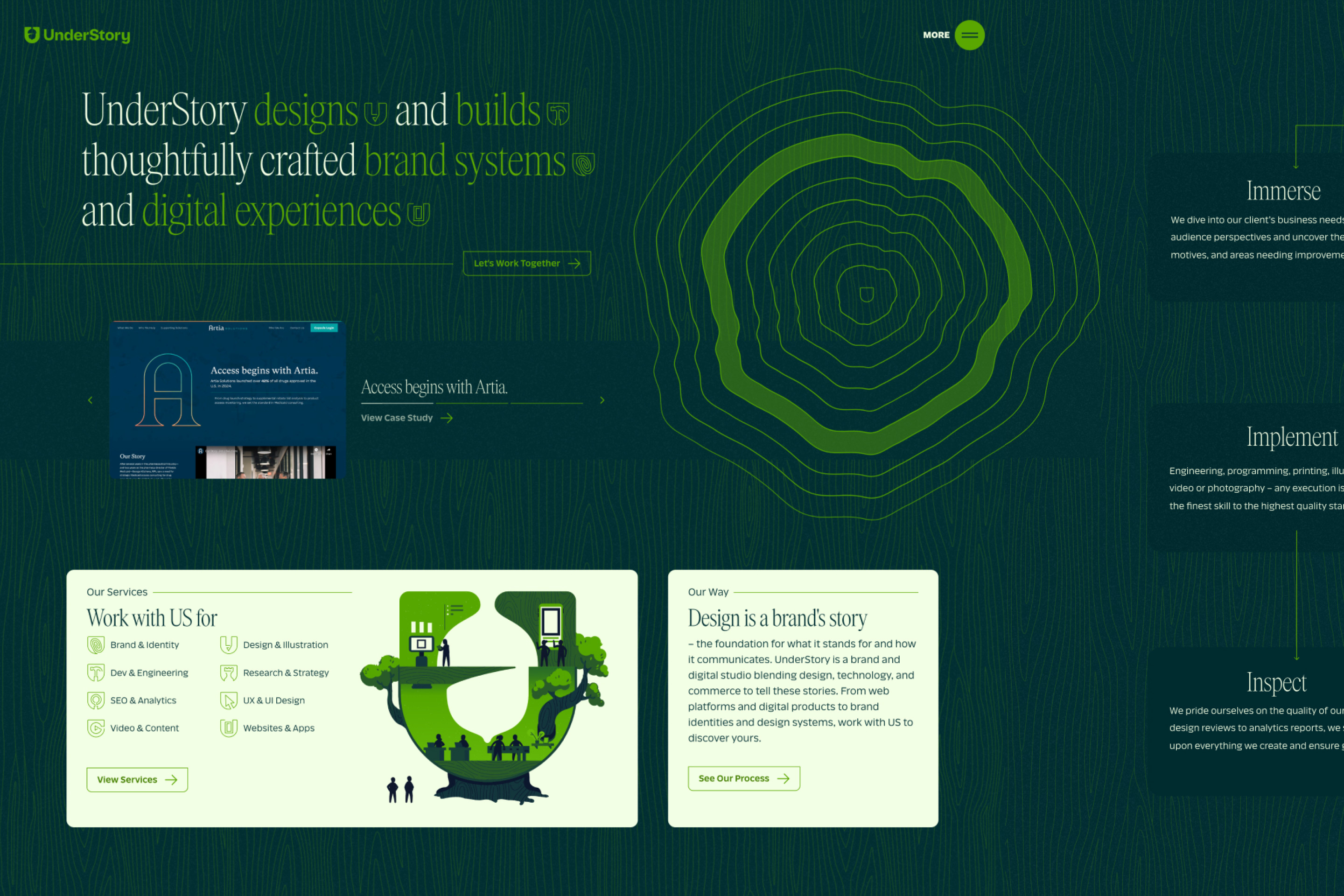
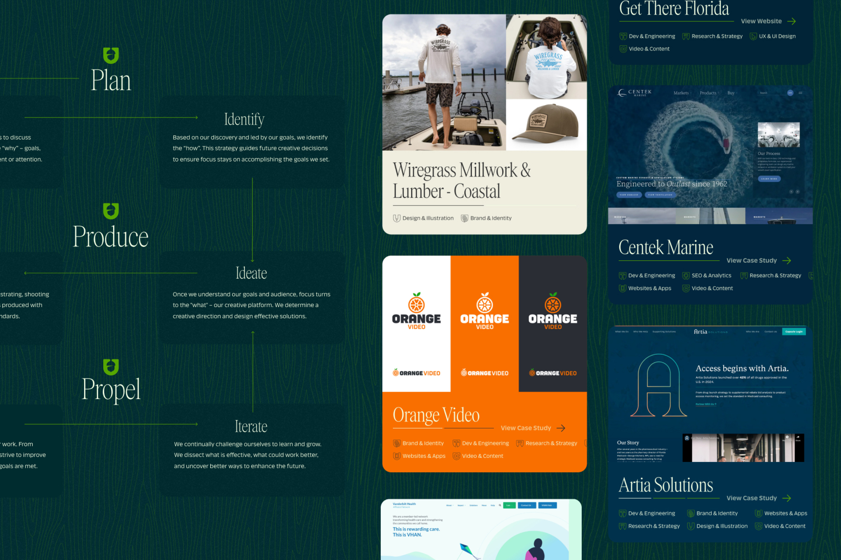
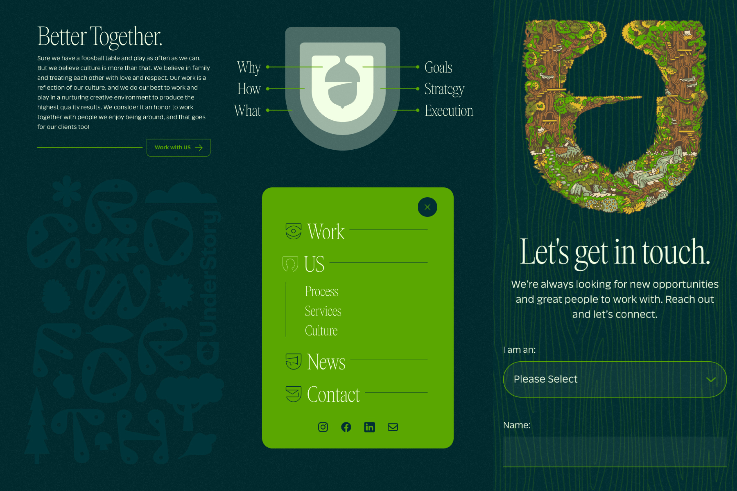
Of course we had to launch a new website.
One major goal was to make sharing work much easier. Our work is our passion, and we haven't been as good about sharing updates in the past as we wanted due to the involved process that was in place. So for our new website, we focused on two ways to share our work: one with our work page itself as our portfolio, borrowing from the popular Instagram slider model, and the other a more involved approach with case-study-style landing pages for portfolio work we feel needs the additional focus. This way we can share work quickly, and always have the option to share more.
Other Posts